You might often want to plot charts with incomplete data points - i.e., missing data. For example when plotting a financial chart, you might not have the entire data - so you might just want to indicate the missing data with a blank space on the chart not plotting anything at that particular place.
FusionCharts has in-built capabilities to plot charts with missing data i.e., discontinuous data. The following charts support discontinuous data:
- All Single series charts (except Pie and Doughnut)
- 3D/2D Multi-series Column/Line/Bar/Area Chart
- The secondary axis (line) on the combination charts.
To plot discontinuous charts, all you need to do is create an empty <set
/> elements where you want empty spaces to occur, like as under:
<set name='...' value='...' ... />
<set name='...' value='...' ... />
<set name='...' value='...' ... />
<set />
<set />
<set />
<set name='...' value='...' ... />
</graph>
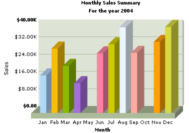
<set name='Jan' value='17400' color='AFD8F8' />
<set name='Feb' value='29800' color='F6BD0F' />
<set name='Mar' value='21800' color='8BBA00' />
<set name='Apr' value='13800' color='A66EDD' />
<set name='May' />
<!-- Note the missing value attribute in the element above -->
<set name='Jun' value='27600' color='F984A1' />
<set name='Jul' value='31800' color='CCCC00' />
<set name='Aug' value='39700' color='eaf5ff' />
<set name='Sep' value='27800' color='ffaaa0' />
<set name='Oct' />
<!-- Note the missing value attribute in the element above -->
<set name='Nov' value='32900' color='ffa000' />
<set name='Dec' value='39800' color='D8D940' />
</graph>
<categories>
<category name='5/2001' showName='1'/>
<category name='6/2001' showName='0'/>
<category name='7/2001' showName='0'/>
<category name='8/2001' showName='1'/>
<category name='9/2001' showName='0'/>
<category name='10/2001' showName='0'/>
<category name='11/2001' showName='1'/>
<category name='12/2001' showName='0'/>
<category name='1/2002' showName='0'/>
<category name='2/2002' showName='1'/>
<category name='3/2002' showName='0'/>
<category name='4/2002' showName='0'/>
<category name='5/2002' showName='1'/>
<category name='6/2002' showName='0'/>
<category name='7/2002' showName='0'/>
<category name='8/2002' showName='1'/>
<category name='9/2002' showName='0'/>
<category name='10/2002' showName='0'/>
<category name='11/2002' showName='1'/>
<category name='12/2002' showName='0'/>
<category name='1/2003' showName='0'/>
<category name='2/2003' showName='1'/>
<category name='3/2003' showName='0'/>
<category name='4/2003' showName='1'/>
</categories>
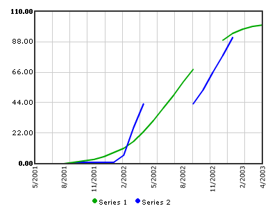
<dataset seriesname='Series 1' color='00A900' showValue='0' lineThickness='2' yaxismaxvalue='100' anchorAlpha='0'>
<set />
<set />
<set />
<set value='0' />
<set value='1' />
<set value='2' />
<set value='3' />
<set value='5' />
<set value='8' />
<set value='11' />
<set value='16' />
<set value='23' />
<set value='31' />
<set value='40' />
<set value='49' />
<set value='59' />
<set value='68' />
<set />
<set />
<set value='89' />
<set value='94' />
<set value='97' />
<set value='99' />
<set value='100' />
</dataset>
<dataset seriesname='Series 2' color='0000FF' showValue='0' lineThickness='2' yaxismaxvalue='100' anchorAlpha='0'>
<set />
<set value='0' />
<set value='0' />
<set value='0' />
<set value='0' />
<set value='1' />
<set value='1' />
<set value='1' />
<set value='1' />
<set value='6' />
<set value='26' />
<set value='43' />
<set />
<set />
<set />
<set />
<set value='43' />
<set value='53' />
<set value='66' />
<set value='78' />
<set value='91' />
<set />
<set />
<set />
</dataset>
</graph>