Combination charts are helpful when you want to compare two quantitative attributes of two different system on a single chart. For example, if you wanted to plot a chart between the pressure and temperature of a system for a particular time range, you could easily use Dual y-axis Column-Line Combination Chart to depict the relation between the same.
FusionCharts offers the following combination charts on dual Y axis:
- 3D Multi-series Column Multi-series Line Dual Y Combination Chart
- 2D Multi-series Column Multi-series Line Dual Y Combination Chart
- Stacked Area Multi-series Line Dual Y Combination Chart
- 2D Stacked Column Multi-series Line Dual Y Combination Chart
and the following on single Y axis:
- 3D Multi-series Column Multi-series Line Single Y Combination Chart
A 3D Multi-series Column Multi-series Line Dual Y Combination Chart looks as under:
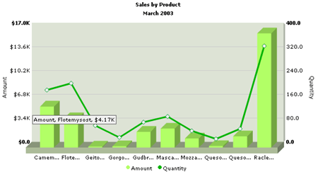
As you can see in the image above, we're plotting a sales chart of a range of products for a particular month (Mar 2003 in this case). On the x-axis, we've the product names. Now, we have two y-axis in this chart:
- The primary y axis (left) representing the Amount figure. All the columns on this chart adhere to this primary y-axis.
- The secondary y axis (right) representing the Quantity figure. The line of the chart adheres to this axis.
For any combination chart, it is necessary to provide atleast 2 datasets - one for the primary axis and the other for the secondary axis. If you do not provide this, the chart would not function properly.
The XML data for the above chart can be listed as under:
<categories>
<category name='Camem...' hoverText='Camembert Pierrot' />
<category name='Flote...' hoverText='Flotemysost' />
<category name='Geito...' hoverText='Geitost' />
<category name='Gorgo...' hoverText='Gorgonzola Telino' />
<category name='Gudbr...' hoverText='Gudbrandsdalsost' />
<category name='Masca...' hoverText='Mascarpone Fabioli' />
<category name='Mozza...' hoverText='Mozzarella di Giovanni' />
<category name='Queso...' hoverText='Queso Cabrales' />
<category name='Queso...' hoverText='Queso Manchego La Pastora' />
<category name='Racle...' hoverText='Raclette Courdavault' />
</categories>
<dataset seriesName='Amount' color='B2FF66' parentYAxis='P' numberPrefix='$'>
<set value='5854.8' />
<set value='4171' />
<set value='137.5' />
<set value='187.5' />
<set value='2246.4' />
<set value='2696' />
<set value='1287.6' />
<set value='210' />
<set value='1603.6' />
<set value='16285.5' />
</dataset>
<dataset lineThickness='3' seriesName='Quantity' parentYAxis='S' color='00B400' anchorBorderColor='009933'>
<set value='174' />
<set value='197' />
<set value='55' />
<set value='15' />
<set value='66' />
<set value='85' />
<set value='37' />
<set value='10' />
<set value='44' />
<set value='322' />
</dataset>
</graph>
The XML structure for a combination chart is very similar to the multi-series chart. So, we won't be discussing all the XML attributes here - what we'll be discussing is the change involved.
First up, let's get to the part where we define which dataset belongs to the primary axis and which dataset belongs to the secondary axis. Each <dataset> element has an attribute parentYAxis in the combination chart. This attribute can take a value of P or S, whereas P denoting primary axis and S denoting secondary axis. Like, in our above example, we have the amount dataset set as primary axis:
<dataset seriesName='Amount' color='B2FF66' parentYAxis='P' numberPrefix='$'>
and the Quantity dataset set as secondary axis:
<dataset lineThickness='3' seriesName='Quantity' parentYAxis='S' color='00B400' anchorBorderColor='009933'>
You can have more than one primary or secondary datasets but atleast one of both is required.
In the 3D Multi-series Column Multi-series Line Single Y Combination Chart, since there is only one y axis (primary), the primary and secondary dataset refers to columns and lines. That is, if you specify the parentYAxis for a dataset as Primary, the data of that dataset would be plotted as columns and if you set parentYAxis for a dataset as Secondary, the data of that dataset would be plotted as lines.
Let's now quickly see the additional attributes the combination charts provides for.
Chart and Axis Titles
Instead of yAxisName (normal multi-series
charts), in the combination charts we've two different attributes specifying
the y-axis titles for two different axis (primary and secondary).
- PYAxisName= "String" : Primary y-Axis text title.
- SYAxisName= "String" : Secondary y-Axis text title.
Chart Numerical Limits
Since the combination chart has two y-axis, you can define the upper and
lower limit for both of them. We use the following attributes instead
of the normal yAxisMinValue and yAxisMaxValue.
- PYAxisMaxValue="value": This attribute determines the upper limit of primary y-axis.
- PYAxisMinValue="value" : This attribute determines the lower limit of primary y-axis.
- SYAxisMaxValue="value": This attribute determines the upper limit of secondary y-axis.
- SYAxisMinValue="value" :
This attribute determines the lower limit of secondary y-axis.
If you don't specify any of the above values, it is automatically calculated by FusionCharts based on the data provided by you.
Generic Properties
- showLimits="1/0" : Option whether to show/hide the chart limit textboxes (primary y-axis).
- showSecondaryLimits="1/0" : Option whether to show/hide the chart limit textboxes (secondary y-axis).
Divisional Lines (Horizontal)
Divisional Lines are horizontal or vertical lines running through the canvas. Each divisional line signfies a smaller unit of the entire axis thus aiding the users in interpreting the chart.
- showDivLineSecondaryValue="1/0" : Option to show/hide the secondary textual value of the divisional line (i.e., text shown on the right side of the canvas for the secondary axis).
Additional <dataset> attributes
First up, you've the new parentYAxis attribute for each dataset, as we had just discussed.
Next, you can define dataset specific numberPrefix and numberSuffix attributes (except the 3D Multi-series Column Multi-series Line Single Y Combination Chart - as we've only one y-axis here). Like, in our above example, the amount dataset has a numberPrefix of $, whereas the same is not applicable to Quantity dataset (for which you can define a numberSuffix of say "Pieces").
There are more chart specific dataset attributes which you can see in the chart-wise XML attributes section.