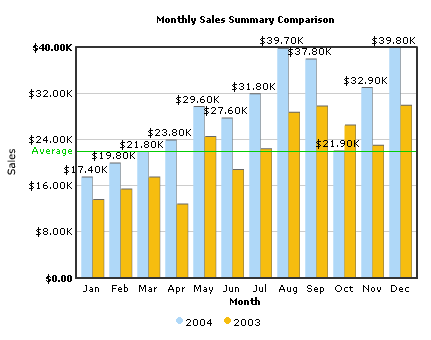
As you can see above, here we are comparing data for the year 2004 and 2003. We've set different colors for both the years to easily recognize the data. Also, we've hid the values for 2003, as they would look too cluttered on the chart (and we're more interested in 2004 data - 2003 data is just to show the comparison).
The XML data for this chart can be listed as under:
<categories>
<category name='Jan' hoverText='January' />
<category name='Feb' hoverText='February' />
<category name='Mar' hoverText='March' />
<category name='Apr' hoverText='April' />
<category name='May' hoverText='May' />
<category name='Jun' hoverText='June' />
<category name='Jul' hoverText='July' />
<category name='Aug' hoverText='August' />
<category name='Sep' hoverText='September' />
<category name='Oct' hoverText='October' />
<category name='Nov' hoverText='November' />
<category name='Dec' hoverText='December' />
</categories>
<dataset seriesName='2004' color='AFD8F8'>
<set value='17400' />
<set value='19800' />
<set value='21800' />
<set value='23800' />
<set value='29600' />
<set value='27600' />
<set value='31800' />
<set value='39700' />
<set value='37800' />
<set value='21900' />
<set value='32900' />
<set value='39800' />
</dataset>
<dataset seriesName='2003' color='F6BD0F' showValues='0'>
<set value='13500'/>
<set value='15300' />
<set value='17400' />
<set value='12700' />
<set value='24400' />
<set value='18700' />
<set value='22300' />
<set value='28600' />
<set value='29700' />
<set value='26400' />
<set value='22900' />
<set value='29800' />
</dataset>
<trendlines>
<line startValue='22000' color='00cc00' displayValue='Average'/>
</trendlines>
</graph>
If you've already gone through the single series XML structure, you'll find notable differences between the two XML structures. There is the new <category> and <dataset> elements and the <set> elements now just contain the value attribute.
However, if you're still unaware about the FusionCharts XML structure,
let's get to the basics first. The <graph>
element is the main element of any FusionCharts XML document - it represents
the starting point and the ending point of data. The <graph>
element has a number of attributes which helps to manipulate the chart.
In the most general form, attributes have the following form:
attributeName = "Value"
e.g., xAxisName="Month"
The attributes can occur in any order and quotes can be single or double like xAxisName='Month'. However, you need to make sure that a particular attribute occurs in the XML only once.
Next to the <graph> element are <categories> element and its child <category> elements. Each <category> element represents a label on the x-axis. The <category> elements need to be defined for all the multi-series charts before you can define the data. For example, in our chart, the categories are the month names (Jan, Feb, Mar .... ) as we're plotting a chart to show monthly sales summary for two consecutive years.
Now, in a multi-series chart, each series of data (i.e., each set of data) needs to be enclosed between a <dataset> element. Like in our example, we're plotting a chart showing the monthly sales trend for 2 different years - the first dataset element's childnodes would be the data for the year 2004 and the second one for 2003. Depending on the chart type, there are a number of properties which you can define for each <dataset> element, which we'll soon see.
Moving on, each <set> element (which is a child element of the <graph> element) represents a set of data which is to be plotted on the graph and determines a set of data which would appear on the graph. A typical <set> element would look like:
<set value="17400" />
You should note that the number of categories should be equal to the number of data rows in each data sets, i.e., if you mention twelve categories (twelve months), the data for both years (2003 & 2004) should also contain twelve <set> elements (twelve rows of data).
Next we have the <trendlines> element. Using this function of the chart, you could draw custom lines on the chart to represent a trend. For example, in our above XML, we have defined a line at 22000 to represent the average sales for the period.
Let's now delve into details of each attribute and also see the general
attributes. We'll try to group all the common attributes for the single
series charts and study them. Each item in the list below isn't however
specifically applicable to all the charts - for chart wise XML attributes,
please see the next section.
Background Properties
- bgColor="HexColorCode" : This attribute sets the background color for the chart. You can set any hex color code as the value of this attribute. Remember that you DO NOT need to assign a "#" at the beginning of the hex color code. In fact, whenever you need to provide any hex color code in FusionCharts XML data document, you do not have to assign the # at the beginning.
- bgAlpha="NumericalValue(0-100)" : This attribute helps you set the alpha (transparency) of the graph. This is particularly useful when you need to load the chart in one of your Flash movies or when you want to set a background image (.swf) for the chart.
- bgSWF="Path of SWF File" : This attribute helps you load an external .swf file as a background for the chart.
Canvas Properties
- canvasBgColor="HexColorCode" : This attribute helps you set the background color of the canvas.
- canvasBgAlpha="NumericalValue(0-100)" : This attribute helps you set the alpha (transparency) of the canvas.
- canvasBorderColor="HexColorCode" : This attribute helps you set the border color of the canvas.
- canvasBorderThickness="NumericalValue(0-100)" : This attribute helps you set the border thickness (in pixels) of the canvas.
- showCanvasBg="1/0" : In case of a 3D canvas, this attributes lets you control whether to show the canvas 3D background.
- showCanvasBase="1/0" : In case of a 3D canvas, this attributes lets you control whether to show the canvas 3D base.
Chart and Axis Titles
- caption="String" : This attribute determines the caption of the chart that would appear at the top of the chart.
- subCaption="String" : Sub-caption of the chart
- xAxisName= "String" : x-Axis text title (if the chart supports axis)
- yAxisName= "String" : y-Axis text title (if the chart supports axis)
Chart Numerical Limits
- yAxisMinValue="value": This attribute determines the lower limit of y-axis.
- yAxisMaxValue="value" : This
attribute determines the upper limit of y-axis.
If you don't specify any of the above values, it is automatically calculated by FusionCharts based on the data provided by you.
Generic Properties
- shownames="1/0" : This attribute can have either of the two possible values: 1,0. It sets the configuration whether the x-axis values (for the data sets) will be displayed or not. By default, this attribute assumes the value 1, which means that the x-axis names will be displayed.
- showValues="1/0" : This attribute can have either of the two possible values: 1,0. It sets the configuration whether the data numerical values will be displayed along with the columns, bars, lines and the pies. By default, this attribute assumes the value 1, which means that the values will be displayed.
- showLimits="1/0" : Option whether to show/hide the chart limit textboxes.
- rotateNames="1/0" : Configuration that sets whether the category name text boxes would be rotated or not.
- animation="1/0" : For chart types that support animation, this attribute sets whether the animation is to be played or whether the entire chart would be rendered at one go.
Font Properties
- baseFont="FontName" : This attribute sets the base font family of the chart font which lies on the canvas i.e., all the values and the names in the chart which lie on the canvas will be displayed using the font name provided here.
- baseFontSize="FontSize" : This attribute sets the base font size of the chart i.e., all the values and the names in the chart which lie on the canvas will be displayed using the font size provided here.
- baseFontColor="HexColorCode" : This attribute sets the base font color of the chart i.e., all the values and the names in the chart which lie on the canvas will be displayed using the font color provided here.
- outCnvBaseFont = "FontName" : This attribute sets the base font family of the chart font which lies outside the canvas i.e., all the values and the names in the chart which lie outside the canvas will be displayed using the font name provided here.
- outCnvBaseFontSze="FontSize" : This attribute sets the base font size of the chart i.e., all the values and the names in the chart which lie outside the canvas will be displayed using the font size provided here.
- outCnvBaseFontColor="HexColorCode": This attribute sets the base font color of the chart i.e., all the values and the names in the chart which lie outside the canvas will be displayed using the font color provided here.
Number Formatting Options
- numberPrefix="$" : Using this attribute, you could add prefix to all the numbers visible on the graph. For example, to represent all dollars figure on the chart, you could specify this attribute to ' $' to show like $40000, $50000.
- numberSuffix="p.a" : Using
this attribute, you could add prefix to all the numbers visible on the
graph. For example, to represent all figure quantified as per annum
on the chart, you could specify this attribute to ' /a' to show like
40000/a, 50000/a.
To use special characters for numberPrefix or numberSuffix, you'll need to URL Encode them. That is, suppose you wish to have numberSuffix as % (like 30%), you'll need to specify it as under:
numberSuffix='%25' - formatNumber="1/0" : This configuration determines whether the numbers displayed on the chart will be formatted using commas, e.g., 40,000 if formatNumber='1' and 40000 if formatNumber='0 '
- formatNumberScale="1/0" : Configuration whether to add K (thousands) and M (millions) to a number after truncating and rounding it - e.g., if formatNumberScale is set to 1, 10434 would become 1.04K (with decimalPrecision set to 2 places). Same with numbers in millions - a M will added at the end.
- decimalSeparator="." : This option helps you specify the character to be used as the decimal separator in a number.
- thousandSeparator="," : This option helps you specify the character to be used as the thousands separator in a number.
- decimalPrecision="2" : Number of decimal places to which all numbers on the chart would be rounded to.
- divLineDecimalPrecision="2": Number of decimal places to which all divisional line (horizontal) values on the chart would be rounded to.
- limitsDecimalPrecision="2" : Number of decimal places to which upper and lower limit values on the chart would be rounded to.
Zero Plane
The zero plane is a simple plane or a 3D plane that signifies
the 0 position on the chart. This plane applies to charts that have a
y-axis and contain negative numbers. If there are no negative numbers
on the chart, you won't see a visible zero plane.
- zeroPlaneShowBorder="1/0" : Whether the border of a 3D zero plane would be plotted or not.
- zeroPlaneBorderColor="Hex Code" : If the border is to be plotted, this attribute sets the border color for the plane.
- zeroPlaneColor="Hex Code" : The intended color for the zero plane.
- zeroPlaneAlpha="Numerical Value 0-100" : The intended transparency for the zero plane.
Divisional Lines (Horizontal)
Divisional Lines are horizontal or vertical lines running through the canvas. Each divisional line signfies a smaller unit of the entire axis thus aiding the users in interpreting the chart.
- numdivlines="NumericalValue" : This attribute sets the number of divisional lines to be drawn.
- divlinecolor="HexColorCode" : The color of grid divisional line.
- divLineThickness="NumericalValue" : Thickness (in pixels) of the grid divisional line.
- divLineAlpha="NumericalValue0-100" : Alpha (transparency) of the grid divisional line.
- showDivLineValue="1/0" : Option to show/hide the textual value of the divisional line.
- showAlternateHGridColor="1/0" : Option on whether to show alternate colored horizontal grid bands.
- alternateHGridColor="HexColorCode" : Color of the alternate horizontal grid bands.
- alternateHGridAlpha="NumericalValue0-100" : Alpha (transparency) of the alternate horizontal grid bands.
Divisional Lines (Vertical)
- numVDivLines="NumericalValue" : Sets the number of vertical divisional lines to be drawn.
- VDivlinecolor="HexColorCode" : Color of vertical grid divisional line.
- VDivLineThickness="NumericalValue" : Thickness (in pixels) of the line
- VDivLineAlpha="NumericalValue0-100" : Alpha (transparency) of the line.
- showAlternateVGridColor="1/0" : Option on whether to show alternate colored vertical grid bands.
- alternateVGridColor="HexColorCode" : Color of the alternate vertical grid bands.
- alternateVGridAlpha="NumericalValue0-100" : Alpha (transparency) of the alternate vertical grid bands.
Hover Caption Properties
The hover caption is the tool tip which shows up when the user moves his mouse over a particular data item (column, line, pie, bar etc.).
- showhovercap="1/0" : Option whether to show/hide hover caption box.
- hoverCapBgColor="HexColorCode" : Background color of the hover caption box.
- hoverCapBorderColor="HexColorCode" : Border color of the hover caption box.
- hoverCapSepChar="Char" : The character specified as the value of this attribute separates the name and value displayed in the hover caption box.
Chart Margins
Chart Margins refers to the empty space left on the top, bottom, left and right of the chart. That means, FusionCharts would leave that much amount of empty space on the chart, before it starts plotting.
- chartLeftMargin="Numerical Value (in pixels)" : Space to be left unplotted on the left side of the chart.
- chartRightMargin="Numerical Value (in pixels)" : Empty space to be left on the right side of the chart
- chartTopMargin="Numerical Value (in pixels)" : Empty space to be left on the top of the chart.
- chartBottomMargin="Numerical Value (in pixels)" : Empty space to be left at the bottom of the chart.
Apart from the above attributes, the <graph> element can also take in a lot more attributes depending on the chart type. We've discussed them in the next section "Chart wise XML Attribute".
The <categories> element can have the following attributes:
- font="font face" : Font face of the category names.
- fontSize="Numeric value" : Font size of the category names.
- fontColor="Hex Color" : Font color of the category names.
- name="String" : This attribute determines the category name which would be displayed on the x-axis as the data label. In our example, we've specified the category names as names of twelve months (in abbreviated format).
- hoverText="String" : Sometimes, you might just want to show the abbreviated names on the x-axis (to avoid cluttering or to make the chart look more legible). However, you still have the option of showing the full name as tool tip using this attribute. Like, in our example, we're showing the abbreviated form "Jan" on our x-axis, but the full word "January" is shown as the tool tip.
- showName="1/0" : This attribute can either the value of 0 or 1. A value of 1 indicates that this data label/category name will be displayed on the chart whereas 0 indicates it won't be displayed. This attribute is particular useful when you want to show/hide names of alternate data items or say every x (th) data item.
Depending on the chart type, the <dataset> element has a number of properties. Four properties are common to all charts (the other attributes have been explained in the Chart-wise XML attribute section):
- seriesName="String" : This attribute denotes the name of the dataset series. That is, if we're plotting a monthly sales analysis for the years 2004 and 2003, the seriesName for the first dataset would be 2004 and that of the second would be 2003. This is the value that would be shown in the legend.
- color="Hex Color" : This attribute sets the color using which that particular set of data would be drawn.
- showValues="1/0": This attribute sets the configuration whether the values (for this particular data set) will be shown alongside the data sets. You can set this value for individual datasets to highlight the most prominent data. Like, in our example, we are showing the values for the year 2004, but we're hiding that of 2003.
- alpha="0-100": This attribute
sets the alpha (transparency) of the entire dataset.
You can also later specify alpha at the <set> level to over ride this value. For example,
<dataset seriesName='Sales – 2001' color='FFF123' alpha='80' ..>
<set value='1'>
<set value='2'>
<set value='3' alpha='90'>
</dataset>
In the above data, the <set> elements with the value 1 and 2 will have an alpha of 80 on the graph, whereas the one containing 3 as its value will have alpha as 90.
<set> element
We now move on to the <set> element which is a child element of the <graph> element and determines a set of data which would appear on the graph.
A <set> element looks as under:
<set value="54" color="3300FF"
link="ShowDetails.asp%3FMonth=Jan" alpha="80" />
Now let's study the the possible attributes of the <set> element:
- value="NumericalValue"
Example: <set name='Jan' value='12345' ...>
This attribute determines the numerical value for the set of data according to which the chart would be built for the concerned set of data.
- color="HexCode"
Example: <set name='Jan' value='12345' color='636363' ...>
This attribute determines the color for the concerned set of data in which it would appear in the graph. This value here overrides the value specified at dataset level.
- link="URL"
Example: <set … link='ShowDetails.asp%3FMonth=Jan' ...>
This attribute defines the hotspots in your graph. The hotspots are links over the data sets. Please note that you'll need to URL Encode all the special characters (like ? and &) present in the link.All the server side scripting languages provide a generic function to URL Encode any string - like in ASP and ASP.NET, we've Server.URLEncode(strURL) and so on.
To open a link in a new window, just put n- in front of the link e.g., link="n-ShowDetails.asp%3FMonth=Jan".
- alpha="Numerical Value 0-100"
Example: <set ... alpha='100' ...>
This attribute determines the transparency of a data set. The range for this attribute is 0 to 100. 0 means complete transparency (the data set won’t be shown on the graph) and 100 means opaque. This option is useful when you want to highlight a particular set of data. This value here overrides the value specified at dataset level.
At the end of the <set> element, you would find a "/"
which signals that it has no more child element
Using the <trendLines>
element (and child elements), you can define trend lines on the charts.
Trend lines are the horizontal lines spanning the chart canvas that aid
in interpretation of data with respect to some previous pre-determined
figure. For each trend line on the chart, you need to define a <line>
element as under:
<line startValue='89.5' endValue='98' color='FF0000'
displayvalue='Roll. Avg.' thickness='2' alpha='100' isTrendZone='0' showOnTop='1'/>
The <line> element can have the following attributes:
- startValue='NumericalValue': The starting y-axis value for the trendline. Say, if you want to plot a slanted trendline from value 102 to 109, the startValue would 102.
- endValue='NumericalValue': The ending y-axis value for the trendline. Say, if you want to plot a slanted trendline from value 102 to 109, the endValue would 109. If you do not specify a value for endValue, it would automatically assume the same value as startValue.
- color='HexCode' : Color of the trend line and its associated text.
- displayValue='StringValue' : If you want to display a string caption for the trend line by its side, you can use this attribute. Example: displayValue='Last Month High'. When you don't supply this attribute, it automatically takes the value of startValue.
- thickness='NumericalValue' : Thickness of the trend line
- isTrendZone='1/0': Whether the trend would display a line, or a zone (filled colored rectangle).
- showOnTop='1/0': Whether the trend line/zone would be displayed over other elements of the chart.
- alpha='NumericalValue0-100': Alpha (transparency) of the trend line