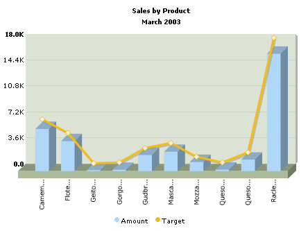
And, the XML data for this chart can be listed as under:
<categories>
<category name='Camem...' hoverText='Camembert Pierrot' />
<category name='Flote...' hoverText='Flotemysost' />
<category name='Geito...' hoverText='Geitost' />
<category name='Gorgo...' hoverText='Gorgonzola Telino' />
<category name='Gudbr...' hoverText='Gudbrandsdalsost' />
<category name='Masca...' hoverText='Mascarpone Fabioli' />
<category name='Mozza...' hoverText='Mozzarella di Giovanni' />
<category name='Queso...' hoverText='Queso Cabrales' />
<category name='Queso...' hoverText='Queso Manchego La Pastora' />
<category name='Racle...' hoverText='Raclette Courdavault' />
</categories>
<dataset seriesName='Amount' color='AFD8F8' numberPrefix='$' >
<set value='5854.8' />
<set value='4171' />
<set value='137.5' />
<set value='187.5' />
<set value='2246.4' />
<set value='2696' />
<set value='1287.6' />
<set value='210' />
<set value='1603.6' />
<set value='16285.5' />
</dataset>
<dataset lineThickness='3' seriesName='Target' parentYAxis='S' color='F6BD0F' anchorBorderColor='F6BD0F'>
<set value='6200' />
<set value='4300' />
<set value='100' />
<set value='210' />
<set value='2200' />
<set value='2900' />
<set value='1000' />
<set value='210' />
<set value='1600' />
<set value='17500' />
</dataset>
</graph>
Background Properties
- bgColor="HexColorCode" : This attribute sets the background color for the chart. You can set any hex color code as the value of this attribute. Remember that you DO NOT need to assign a "#" at the beginning of the hex color code. In fact, whenever you need to provide any hex color code in FusionCharts XML data document, you do not have to assign the # at the beginning.
- bgAlpha="NumericalValue(0-100)" : This attribute helps you set the alpha (transparency) of the graph. This is particularly useful when you need to load the chart in one of your Flash movies or when you want to set a background image (.swf) for the chart.
- bgSWF="Path of SWF File" : This attribute helps you load an external .swf file as a background for the chart.
Canvas Properties
- canvasBgColor="HexColorCode" : This attribute helps you set the background color of the canvas. The background of the canvas is the one behind the columns.
- canvasBaseColor="HexColorCode" : This attribute helps you set the color of the canvas base. The canvas abse is the on which the base of the columns are placed..
- canvasBaseDepth="Numerical Value" : This attribute helps you set the height (3D Depth) of the canvas base.
- canvasBaseDepth="Numerical Value" : This attribute helps you set the height (3D Depth) of the canvas base.
- canvasBgDepth="Numerical Value" : This attribute helps you set the 3D Depth of the canvas background.
- showCanvasBg="1/0" : This attribute helps us set whether we need to show the canvas background.
- showCanvasBase="1/0" : This attribute helps us set whether we need to show the canvas base.
Chart and Axis Titles
- caption="String" : This attribute determines the caption of the chart that would appear at the top of the chart.
- subCaption="String" : Sub-caption of the chart
- xAxisName= "String" : x-Axis text title (if the chart supports axis)
- yAxisName= "String" : y-Axis text title (if the chart supports axis)
Chart Numerical Limits
- yAxisMinValue="value": This attribute determines the lower limit of y-axis.
- yAxisMaxValue="value" : This
attribute determines the upper limit of y-axis.
If you don't specify any of the above values, it is automatically calculated by FusionCharts based on the data provided by you.
Generic Properties
- shownames="1/0" : This attribute can have either of the two possible values: 1,0. It sets the configuration whether the x-axis values (for the data sets) will be displayed or not. By default, this attribute assumes the value 1, which means that the x-axis names will be displayed.
- showValues="1/0" : This attribute can have either of the two possible values: 1,0. It sets the configuration whether the data numerical values will be displayed along with the columns, bars, lines and the pies. By default, this attribute assumes the value 1, which means that the values will be displayed.
- showLimits="1/0" : Option whether to show/hide the chart limit textboxes.
- rotateNames="1/0" : Configuration that sets whether the category name text boxes would be rotated or not.
- animation="1/0" : This attribute sets whether the animation is to be played or whether the entire chart would be rendered at one go.
- showLegend="1/0" : This attribute sets whether the legend would be displayed at the bottom of the chart.
Font Properties
- baseFont="FontName" : This attribute sets the base font family of the chart font which lies on the canvas i.e., all the values and the names in the chart which lie on the canvas will be displayed using the font name provided here.
- baseFontSize="FontSize" : This attribute sets the base font size of the chart i.e., all the values and the names in the chart which lie on the canvas will be displayed using the font size provided here.
- baseFontColor="HexColorCode" : This attribute sets the base font color of the chart i.e., all the values and the names in the chart which lie on the canvas will be displayed using the font color provided here.
- outCnvBaseFont = "FontName" : This attribute sets the base font family of the chart font which lies outside the canvas i.e., all the values and the names in the chart which lie outside the canvas will be displayed using the font name provided here.
- outCnvBaseFontSze="FontSize" : This attribute sets the base font size of the chart i.e., all the values and the names in the chart which lie outside the canvas will be displayed using the font size provided here.
- outCnvBaseFontColor="HexColorCode": This attribute sets the base font color of the chart i.e., all the values and the names in the chart which lie outside the canvas will be displayed using the font color provided here.
Number Formatting Options
- numberPrefix="$" : Using this attribute, you could add prefix to all the numbers visible on the graph. For example, to represent all dollars figure on the chart, you could specify this attribute to ' $' to show like $40000, $50000.
- numberSuffix="p.a" : Using
this attribute, you could add prefix to all the numbers visible on the
graph. For example, to represent all figure quantified as per annum
on the chart, you could specify this attribute to ' /a' to show like
40000/a, 50000/a.
To use special characters for numberPrefix or numberSuffix, you'll need to URL Encode them. That is, suppose you wish to have numberSuffix as % (like 30%), you'll need to specify it as under:
numberSuffix='%25' - formatNumber="1/0" : This configuration determines whether the numbers displayed on the chart will be formatted using commas, e.g., 40,000 if formatNumber='1' and 40000 if formatNumber='0 '
- formatNumberScale="1/0" : Configuration whether to add K (thousands) and M (millions) to a number after truncating and rounding it - e.g., if formatNumberScale is set to 1, 10434 would become 1.04K (with decimalPrecision set to 2 places). Same with numbers in millions - a M will added at the end.
- decimalSeparator="." : This option helps you specify the character to be used as the decimal separator in a number.
- thousandSeparator="," : This option helps you specify the character to be used as the thousands separator in a number.
- decimalPrecision="2" : Number of decimal places to which all numbers on the chart would be rounded to.
- divLineDecimalPrecision="2": Number of decimal places to which all divisional line (horizontal) values on the chart would be rounded to.
- limitsDecimalPrecision="2" : Number of decimal places to which upper and lower limit values on the chart would be rounded to.
Line Properties
- lineColor="Hex Code" : Color of the chart line.
- lineThickness="Numeric Value" : Thickness of the line (in pixels).
- lineAlpha="0-100" : Transparency of the line.
Line Shadow Properties
- showShadow="1/0" : This attribute helps you set whether the line shadow would be shown or not.
- shadowColor="Hex Code" : If you want to set your own shadow color, you'll need to specify that color for this attribute.
- shadowThickness="Numeric Value" : This attribute helps you set the thickness of the shadow line (in pixels).
- shadowAlpha ="0-100" : This attribute sets the transparency of the shadow line.
- shadowXShift="Numeric Value" : This attribute helps you set the x shift of the shadow line from the chart line. That is, if you want to show the shadow 3 pixel right from the actual line, set this attribute to 3. Similarly, if you want the shadow to appear on the left of the actual line, set it to -3.
- shadowYShift="Numeric Value" : This attribute helps you set the y shift of the shadow line from the chart line. That is, if you want to show the shadow 3 pixel below the actual line, set this attribute to 3. Similarly, if you want the shadow to appear above the actual line, set it to -3.
Anchor properties
Anchors (or the marker points) are the polygons which appear at the joint
of two consecutive lines. On a line chart, the anchors are the elements
which react to the hover caption and link for that particular data point.
You can customize all the facets of the anchors using the properties below:
- showAnchors="1/0": Configuration whether the anchors would be shown on the chart or not. If the anchors are not shown, then the hover caption and link functions won't work.
- anchorSides="Numeric Value greater than 3": This attribute sets the number of sides the anchor will have. For e.g., an anchor with 3 sides would represent a triangle, with 4 it would be a square and so on.
- anchorRadius="Numeric Value" : This attribute sets the radius (in pixels) of the anchor. Greater the radius, bigger would be the anchor size.
- anchorBorderColor="Hex Code" : Border Color of the anchor.
- anchorBorderThickness="Numeric Value" : Thickness of the anchor border (in pixels).
- anchorBgColor="Hex Code" : Background color of the anchor.
- anchorBgAlpha="Numeric Value" : Alpha of the anchor background.
- anchorAlpha="Numeric Value" : This function lets you set the tranparency of the entire anchor (including the border). This attribute is particularly useful, when you do not want the anchors to be visible on the chart, but you want the hover caption and link functionality. In that case, you can set anchorAlpha to 0.
Zero Plane
The zero plane is a 3D plane that signifies the 0 position on
the chart. If there are no negative numbers on the chart, you won't see
a visible zero plane.
- zeroPlaneShowBorder="1/0" : Whether the border of a 3D zero plane would be plotted or not.
- zeroPlaneBorderColor="Hex Code" : If the border is to be plotted, this attribute sets the border color for the plane.
- zeroPlaneColor="Hex Code" : The intended color for the zero plane.
- zeroPlaneAlpha="Numerical Value 0-100" : The intended transparency for the zero plane.
Divisional Lines (Horizontal)
Divisional Lines are horizontal or vertical lines running through the canvas. Each divisional line signfies a smaller unit of the entire axis thus aiding the users in interpreting the chart.
- numdivlines="NumericalValue" : This attribute sets the number of divisional lines to be drawn.
- divlinecolor="HexColorCode" : The color of grid divisional line.
- divLineThickness="NumericalValue" : Thickness (in pixels) of the grid divisional line.
- divLineAlpha="NumericalValue0-100" : Alpha (transparency) of the grid divisional line.
- showDivLineValue="1/0" : Option to show/hide the textual value of the divisional line.
Hover Caption Properties
The hover caption is the tool tip which shows up when the user moves his mouse over a particular data item (column, line, pie, bar etc.).
- showhovercap="1/0" : Option whether to show/hide hover caption box.
- hoverCapBgColor="HexColorCode" : Background color of the hover caption box.
- hoverCapBorderColor="HexColorCode" : Border color of the hover caption box.
- hoverCapSepChar="Char" : The character specified as the value of this attribute separates the name and value displayed in the hover caption box.
Chart Margins
Chart Margins refers to the empty space left on the top, bottom, left and right of the chart. That means, FusionCharts would leave that much amount of empty space on the chart, before it starts plotting.
- chartLeftMargin="Numerical Value (in pixels)" : Space to be left unplotted on the left side of the chart.
- chartRightMargin="Numerical Value (in pixels)" : Empty space to be left on the right side of the chart
- chartTopMargin="Numerical Value (in pixels)" : Empty space to be left on the top of the chart.
- chartBottomMargin="Numerical Value (in pixels)" : Empty space to be left at the bottom of the chart.
The <categories> element can have the following attributes:
- font="font face" : Font face of the category names.
- fontSize="Numeric value" : Font size of the category names.
- fontColor="Hex Color" : Font color of the category names.
- name="String" : This attribute determines the category name which would be displayed on the x-axis as the data label. In our example, we've specified the category names as names of six months (in abbreviated format).
- hoverText="String" : Sometimes, you might just want to show the abbreviated names on the x-axis (to avoid cluttering or to make the chart look more legible). However, you still have the option of showing the full name as tool tip using this attribute. Like, in our example, we're showing the abbreviated form "Jan" on our x-axis, but the full word "January" is shown as the tool tip.
- showName="1/0" : This attribute can either the value of 0 or 1. A value of 1 indicates that this data label/category name will be displayed on the chart whereas 0 indicates it won't be displayed. This attribute is particular useful when you want to show/hide names of alternate data items or say every x (th) data item.
The following attributes can be defined for the <dataset> element.
- parentYAxis="P/S" : Each <dataset>
element has an attribute parentYAxis in
the combination chart. This attribute can take a value of P or S, whereas
P denoting primary axis (the columns) and S denoting secondary axis
(line). Like, in our above example, we have the amount dataset set as
primary axis:
<dataset seriesname='Amount' ... parentYAxis='P' numberPrefix='$'>
and the Target dataset set as secondary axis:
<dataset seriesname='Target' ... parentYAxis='S' lineThickness='4'>
You can have more than one primary or secondary datasets but atleast one of both is required. - seriesName="String" : This attribute denotes the name of the dataset series. That is, if we're plotting a monthly sales analysis for the years 2004 and 2003, the seriesName for the first dataset would be 2004 and that of the second would be 2003. This is the value that would be shown in the legend.
- color="Hex Color" : This attribute sets the color using which that particular set of data would be drawn.
- showValues="1/0": This attribute sets the configuration whether the values (for this particular data set) will be shown alongside the data sets. You can set this value for individual datasets to highlight the most prominent data.
- alpha="0-100": This attribute
sets the alpha (transparency) of the entire dataset.
You can also later specify alpha at the <set> level to over ride this value. For example,
<dataset seriesName='Sales – 2001' color='FFF123' alpha='80' ..>
<set value='1'>
<set value='2'>
<set value='3' alpha='90'>
</dataset>
In the above data, the <set> elements with the value 1 and 2 will have an alpha of 80 on the graph, whereas the one containing 3 as its value will have alpha as 90.
Dataset specific anchor properties
The anchor properties below would be applicable for anchor of
this particular dataset only.
- showAnchors="1/0": Configuration whether the anchors would be shown for this dataset or not. If the anchors are not shown, then the hover caption and link functions won't work.
- anchorSides="Numeric Value greater than 3": This attribute sets the number of sides the anchors (of this dataset) will have. For e.g., an anchor with 3 sides would represent a triangle, with 4 it would be a square and so on.
- anchorRadius="Numeric Value" : This attribute sets the radius (in pixels) of the anchor. Greater the radius, bigger would be the anchor size.
- anchorBorderColor="Hex Code" : Border Color of the anchor.
- anchorBorderThickness="Numeric Value" : Thickness of the anchor border (in pixels).
- anchorBgColor="Hex Code" : Background color of the anchor.
- anchorBgAlpha="Numeric Value" : Alpha of the anchor background.
- anchorAlpha="Numeric Value" : This function lets you set the tranparency of the entire anchor (including the border). This attribute is particularly useful, when you do not want the anchors to be visible on the chart, but you want the hover caption and link functionality. In that case, you can set anchorAlpha to 0.
Dataset specific line thickness
- lineThickness="Numeric Value" :
Thickness of the line (in pixels).
<set> element
We now move on to the <set> element which is a child element of the <dataset> element and determines a set of data which would appear on the graph.
A <set> element looks as under:
<set value="54" color="3300FF"
link="ShowDetails.asp%3FMonth=Jan" alpha="80" />
Now let's study the the possible attributes of the <set> element:
- value="NumericalValue"
Example: <set name='Jan' value='12345' ...>
This attribute determines the numerical value for the set of data according to which the chart would be built for the concerned set of data.
- link="URL"
Example: <set … link='ShowDetails.asp%3FMonth=Jan' ...>
This attribute defines the hotspots in your graph. The hotspots are links over the data sets. Please note that you'll need to URL Encode all the special characters (like ? and &) present in the link.All the server side scripting languages provide a generic function to URL Encode any string - like in ASP and ASP.NET, we've Server.URLEncode(strURL) and so on.
To open a link in a new window, just put n- in front of the link e.g., link="n-ShowDetails.asp%3FMonth=Jan".
- alpha="Numerical Value 0-100"
Example: <set ... alpha='100' ...>
This attribute determines the transparency of a data set. The range for this attribute is 0 to 100. 0 means complete transparency (the data set won’t be shown on the graph) and 100 means opaque. This option is useful when you want to highlight a particular set of data. This value here overrides the value specified at dataset level.
At the end of the <set> element, you would find a "/"
which signals that it has no more child element